
Capital One
·
Financial Services
FS Design System V2: Brand Refresh
FS Design System V2: Brand Refresh
FS Design System V2: Brand Refresh
Elevating the system for a modernized, refreshed brand.
Elevating the system for a modernized, refreshed brand.
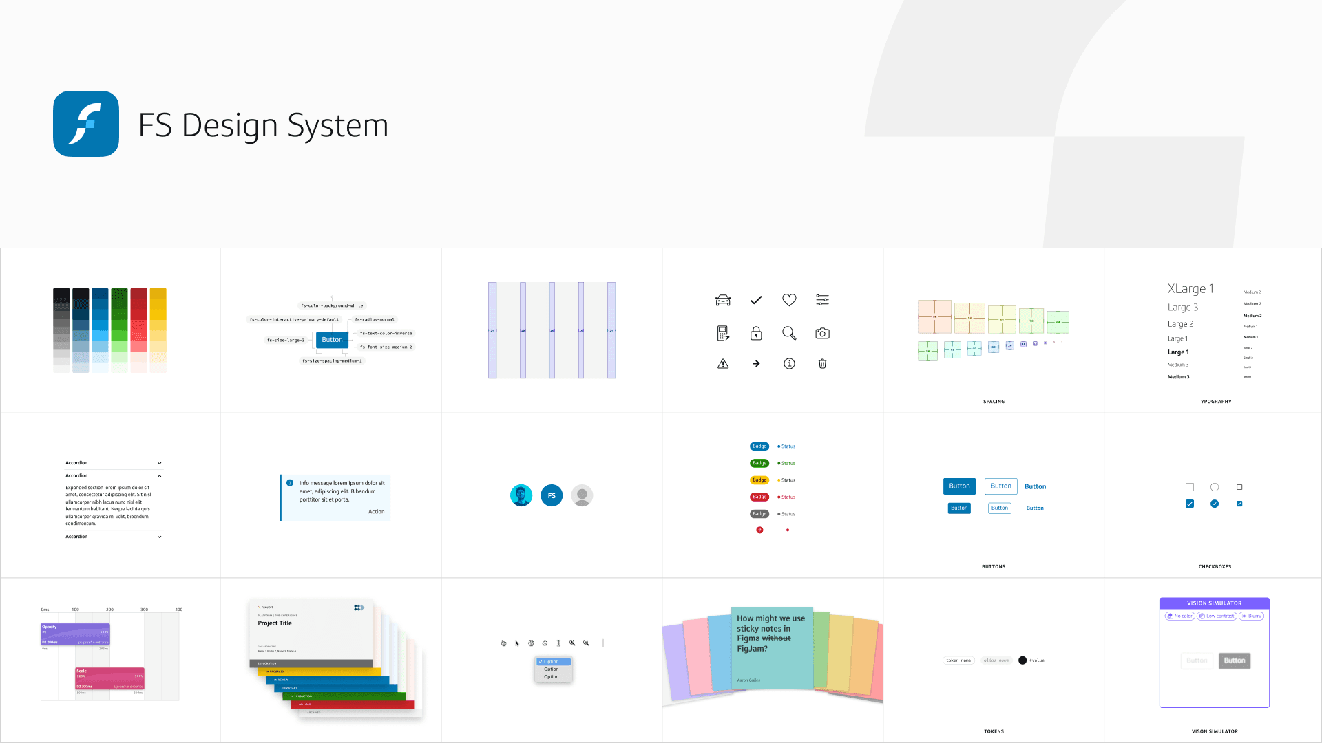
A major update to the FS Design System that enabled a seamless rollout of Capital One’s refreshed brand across the Financial Services division. Every element in the system was refactored to align with new brand standards, with full support for theming and dark mode, along with improved consistency, performance, and accessibility. The result set a new benchmark for quality and cohesion across the division.
A major update to the FS Design System that enabled a seamless rollout of Capital One’s refreshed brand across the Financial Services division. Every element in the system was refactored to align with new brand standards, with full support for theming and dark mode, along with improved consistency, performance, and accessibility. The result set a new benchmark for quality and cohesion across the division.
Role
Design System Lead, Manager
Timeline
Mar 2024 – Mar 2025
1 year
Team
1 Head of Design
1 Design System Lead (me)
1 Senior Designer
1 Development Lead
1 Front-End Developer
Multiple community contributors
Tools
Figma
Leonardo
Google Workspace
Jira
Skills
Accessibility (WCAG)
Design Strategy
Design Systems
Design Tokens
Documentation
Educational Resources
Figma Auto Layout
Figma Libraries
Figma Variables
Governance
Iconography
Research
Responsive Web
Typography
UI Design
Version Control
Visual Design
Web Components
Challenge
Our moment to modernize
When Capital One rolled out its refreshed brand guidelines, every product team was expected to adopt the new standards within 2024. For the FS Design System, that meant rethinking everything (colors, typography, iconography, components) and adding support for theming.
We saw this as more than just a visual update. It was a rare opportunity to rebuild the system from the ground up: clean up legacy patterns, optimize performance, and deliver the quality-of-life improvements we’d been waiting to make.
To move fast without sacrificing quality, we proposed a phased approach. In just three months, we committed to refactoring and releasing the most-used assets from V1 first. Once those were complete, we prioritized the needs of early adopters, then followed through with full system parity in the months ahead.
The goal: give early adopters a seamless migration path, minimize disruption, and set the standard for division-wide adoption (with documentation, tooling, and guidance to support rollout at scale).


Process
Audit, prioritize, implement, support
We partnered early with the brand and enterprise design system teams to explore and shape the refreshed standards. Once aligned, we developed a phased rollout strategy to manage scope, deliver value quickly, and ensure cross-team alignment.
We kicked things off with a comprehensive audit, mapped against the new brand guidelines and enterprise work. Using usage data and community input, we prioritized high-impact elements and tracked progress in a living status dashboard.


Adapt to meet demand
Initially, to move fast, we launched the updated assets without theming or documentation. Once adoption ramped up, we quickly pivoted in response to a flood of questions and requests. We restructured our workflow to deliver a scalable theming solution and robust documentation to better meet the evolving needs of our community.

Solution
Refreshed brand, refreshed libraries
With a clear rollout strategy in place, we brought the V2 system to life, translating the refreshed brand into a flexible, modern, and scalable design system.
We decided to create a completely new set of Figma libraries for V2. This allowed teams to continue using V1 until they were ready to migrate and avoid any disruptions.


Automating accessible color palettes
To ensure the new brand palette met digital accessibility standards, we used Leonardo to generate uniform color scales based on relative luminance stops, creating smooth ramps from 000 (lightest) to 1000 (darkest).
We applied a simple contrast formula to guide pairings in a consistent, repeatable way:
4.5:1 color contrast
(foreground - background >= ±500)
3:1 color contrast
(foreground - background >= ±350)
This approach gave us a flexible, scalable foundation that not only supported the core brand palette, but also extended seamlessly to premium and private-label themes.


Variables for everything
In V2, we transitioned from traditional styles to a fully variable-powered system in Figma. We defined variables for color, corner radius, spacing, sizing, typography, and more, unlocking the full potential of our design tokens.
This shift helped with design-to-dev handoff and set the stage for scalable support for light and dark modes, wireframing, and theming (a first for the division).


Theming & modes
We introduced flexible support for brand themes and color modes to meet a wide range of FS product needs.
This approach allowed teams to adopt the updates incrementally, supporting everything from low-fidelity prototyping and legacy migration to full premium brand expression.
Brand themes
Capital One
The default theme for all Capital One products, using a deep blue palette for interactive elements.
Eclipse
A premium theme designed for select products, featuring the darkest blues from the brand palette.
Legacy
Visually aligned with V1 of the FS Design System, using Capital One’s older blue and semantic colors. Enables teams to migrate to V2 while maintaining a familiar look and feel.
🔒 Test
An internal theme used to stress-test proper token usage.
Color modes
Light
Default mode with light backgrounds and dark text, optimized for bright environments.
Dark
Inverted mode with dark backgrounds and light text, ideal for low-light environments.
Wireframe (Light)
Low-fidelity mode with all color removed, designed for bright environments.
Wireframe (Dark)
Inverted low-fidelity mode with all color removed, designed for low-light environments.


Fewer variants, more power
We decided to rebuild every component from the ground up using Figma’s component properties. This allowed us to eliminate unnecessary base components and dramatically reduce the number of variants, improving performance and memory while making the system easier for our design community to use.
In some cases, we reduced variant counts by over 80%, while still supporting the full range of use cases. The result was a leaner, faster, more efficient library that better reflected the way designers actually work.


A bold new set of icons
We partnered with the brand and enterprise design system teams to completely overhaul our UI icons. Each icon was redrawn using a 2px stroke weight to align with the updated visual language, improving legibility and visual consistency across platforms.
The final set included over 1,000 unique icons, significantly expanding the range of metaphors available to product teams while bringing the library in line with the refreshed brand.

Documentation that meets people where they are
We created a dedicated documentation space in Figma, placed near the libraries to “meet designers where they are.” This gave our design community quick access to component usage, visual examples, and best practices without disrupting their workflow.
For a broader audience (including leadership, developers, and product partners), we created a companion doc site in Google Sites. It centralized everything from usage guidelines to getting started tips, migration support, brand context, and video walkthroughs, making the refresh more accessible across all disciplines.

Quality of life improvements
In the spirit of leaving it better than we found it, we used the V2 refresh as an opportunity to improve the quality of everything in the system, from design assets to documentation to code.
We reorganized and renamed components to improve parity between design and code, applied consistent component properties, added min/max constraints, deprecated unnecessary variants, added support for aspect ratios, restructured documentation, reduced file bloat, and doubled down on slots.
These upgrades made a meaningful impact on day-to-day productivity across the division.


Results
Rebuilt in record time
In just under three months, we launched the V2 Figma libraries with a fully refactored foundation and an initial set of components, built from the ground up to align with the new brand and modern system architecture.
From there, we expanded coverage, produced robust documentation, and supported early adopters through a seamless transition. The result: a fully refreshed system now powering product experiences across the Financial Services department.
1.1k+
Design tokens
1k+
Redesigned icons
5
Color modes
4
Brand themes
30+
Refactored components
80%
Variant reduction
60+
Pages of documentation
10+
Migrated teams
Shipped with speed, adopted with ease
What made V2 successful wasn’t just speed, it was clarity, foresight, and a deep focus on quality. We made it easy for teams to adopt the updated system, adapt it to their needs, and migrate with confidence.
Delivered V2 alpha libraries to enable a frictionless migration for early adopters
Supported V1 libraries in parallel to address high-priority bugs during the transition
Optimized components by reducing variants by 80%, improving memory usage and performance
Improved alignment across design and code through shared structure and naming conventions
Expanded documentation for every element and added onboarding and migration resources
Unlocked support for premium and private-label theming, plus light, dark, and wireframe modes
Reduced manual migration effort through legacy themes and automated dev scripts
Reflection
To tabula rasa
or not
One of the harder decisions we made was to create an entirely new set of libraries for V2. We were initially hesitant, knowing it would require teams to manually migrate in order to align with the refreshed brand. But ultimately, it was the right call.
A clean slate gave us the clarity and freedom to modernize the system, improve usability, reduce memory limitations, and take full advantage of variables and component properties. With strong migration guides and support in place, teams adopted V2 successfully, and the long-term benefits far outweighed the short-term lift.
And for teams that still needed access to V1, the legacy libraries remained available without disruption.
Challenge
Our moment to modernize
When Capital One rolled out its refreshed brand guidelines, every product team was expected to adopt the new standards within 2024. For the FS Design System, that meant rethinking everything (colors, typography, iconography, components) and adding support for theming.
We saw this as more than just a visual update. It was a rare opportunity to rebuild the system from the ground up: clean up legacy patterns, optimize performance, and deliver the quality-of-life improvements we’d been waiting to make.
To move fast without sacrificing quality, we proposed a phased approach. In just three months, we committed to refactoring and releasing the most-used assets from V1 first. Once those were complete, we prioritized the needs of early adopters, then followed through with full system parity in the months ahead.
The goal: give early adopters a seamless migration path, minimize disruption, and set the standard for division-wide adoption (with documentation, tooling, and guidance to support rollout at scale).
Process
Audit, prioritize, implement, support
We partnered early with the brand and enterprise design system teams to explore and shape the refreshed standards. Once aligned, we developed a phased rollout strategy to manage scope, deliver value quickly, and ensure cross-team alignment.
We kicked things off with a comprehensive audit, mapped against the new brand guidelines and enterprise work. Using usage data and community input, we prioritized high-impact elements and tracked progress in a living status dashboard.
Adapt to meet demand
Initially, to move fast, we launched the updated assets without theming or documentation. Once adoption ramped up, we quickly pivoted in response to a flood of questions and requests. We restructured our workflow to deliver a scalable theming solution and robust documentation to better meet the evolving needs of our community.
Solution
Refreshed brand, refreshed libraries
With a clear rollout strategy in place, we brought the V2 system to life, translating the refreshed brand into a flexible, modern, and scalable design system.
We decided to create a completely new set of Figma libraries for V2. This allowed teams to continue using V1 until they were ready to migrate and avoid any disruptions.
Automating accessible color palettes
To ensure the new brand palette met digital accessibility standards, we used Leonardo to generate uniform color scales based on relative luminance stops, creating smooth ramps from 000 (lightest) to 1000 (darkest).
We applied a simple contrast formula to guide pairings in a consistent, repeatable way:
4.5:1 color contrast
(foreground - background >= ±500)
3:1 color contrast
(foreground - background >= ±350)
This approach gave us a flexible, scalable foundation that not only supported the core brand palette, but also extended seamlessly to premium and private-label themes.
Variables for everything
In V2, we transitioned from traditional styles to a fully variable-powered system in Figma. We defined variables for color, corner radius, spacing, sizing, typography, and more, unlocking the full potential of our design tokens.
This shift helped with design-to-dev handoff and set the stage for scalable support for light and dark modes, wireframing, and theming (a first for the division).
Theming & modes
We introduced flexible support for brand themes and color modes to meet a wide range of FS product needs.
This approach allowed teams to adopt the updates incrementally, supporting everything from low-fidelity prototyping and legacy migration to full premium brand expression.
Brand themes
Capital One
The default theme for all Capital One products, using a deep blue palette for interactive elements.
Eclipse
A premium theme designed for select products, featuring the darkest blues from the brand palette.
Legacy
Visually aligned with V1 of the FS Design System, using Capital One’s older blue and semantic colors. Enables teams to migrate to V2 while maintaining a familiar look and feel.
🔒 Test
An internal theme used to stress-test proper token usage.
Color modes
Light
Default mode with light backgrounds and dark text, optimized for bright environments.
Dark
Inverted mode with dark backgrounds and light text, ideal for low-light environments.
Wireframe (Light)
Low-fidelity mode with all color removed, designed for bright environments.
Wireframe (Dark)
Inverted low-fidelity mode with all color removed, designed for low-light environments.
Fewer variants, more power
We decided to rebuild every component from the ground up using Figma’s component properties. This allowed us to eliminate unnecessary base components and dramatically reduce the number of variants, improving performance and memory while making the system easier for our design community to use.
In some cases, we reduced variant counts by over 80%, while still supporting the full range of use cases. The result was a leaner, faster, more efficient library that better reflected the way designers actually work.
A bold new set of icons
We partnered with the brand and enterprise design system teams to completely overhaul our UI icons. Each icon was redrawn using a 2px stroke weight to align with the updated visual language, improving legibility and visual consistency across platforms.
The final set included over 1,000 unique icons, significantly expanding the range of metaphors available to product teams while bringing the library in line with the refreshed brand.
Documentation that meets people where they are
We created a dedicated documentation space in Figma, placed near the libraries to “meet designers where they are.” This gave our design community quick access to component usage, visual examples, and best practices without disrupting their workflow.
For a broader audience (including leadership, developers, and product partners), we created a companion doc site in Google Sites. It centralized everything from usage guidelines to getting started tips, migration support, brand context, and video walkthroughs, making the refresh more accessible across all disciplines.
Quality of life improvements
In the spirit of leaving it better than we found it, we used the V2 refresh as an opportunity to improve the quality of everything in the system, from design assets to documentation to code.
We reorganized and renamed components to improve parity between design and code, applied consistent component properties, added min/max constraints, deprecated unnecessary variants, added support for aspect ratios, restructured documentation, reduced file bloat, and doubled down on slots.
These upgrades made a meaningful impact on day-to-day productivity across the division.
Results
Rebuilt in record time
In just under three months, we launched the V2 Figma libraries with a fully refactored foundation and an initial set of components, built from the ground up to align with the new brand and modern system architecture.
From there, we expanded coverage, produced robust documentation, and supported early adopters through a seamless transition. The result: a fully refreshed system now powering product experiences across the Financial Services department.
1.1k+
Design tokens
1k+
Redesigned icons
5
Color modes
4
Brand themes
30+
Refactored components
80%
Variant reduction
60+
Pages of documentation
10+
Migrated teams
Shipped with speed, adopted with ease
What made V2 successful wasn’t just speed, it was clarity, foresight, and a deep focus on quality. We made it easy for teams to adopt the updated system, adapt it to their needs, and migrate with confidence.
Delivered V2 alpha libraries to enable a frictionless migration for early adopters
Supported V1 libraries in parallel to address high-priority bugs during the transition
Optimized components by reducing variants by 80%, improving memory usage and performance
Improved alignment across design and code through shared structure and naming conventions
Expanded documentation for every element and added onboarding and migration resources
Unlocked support for premium and private-label theming, plus light, dark, and wireframe modes
Reduced manual migration effort through legacy themes and automated dev scripts
Reflection
To tabula rasa or not
One of the harder decisions we made was to create an entirely new set of libraries for V2. We were initially hesitant, knowing it would require teams to manually migrate in order to align with the refreshed brand. But ultimately, it was the right call.
A clean slate gave us the clarity and freedom to modernize the system, improve usability, reduce memory limitations, and take full advantage of variables and component properties. With strong migration guides and support in place, teams adopted V2 successfully, and the long-term benefits far outweighed the short-term lift.
And for teams that still needed access to V1, the legacy libraries remained available without disruption.
Selected Work
Selected Work
Selected Work
FS Design System V2: Brand Refresh
FS Design System V2: Brand Refresh
Elevating the system for a modernized, refreshed brand.
FS Design System V2: Brand Refresh
FS Design System V2: Brand Refresh
Elevating the system for a modernized, refreshed brand.
FS Design System V2: Brand Refresh
FS Design System V2: Brand Refresh
Elevating the system for a modernized, refreshed brand.
FS Design System V1
FS Design System V1
Establishing a division-first design system for Financial Services.
FS Design System V1
FS Design System V1
Establishing a division-first design system for Financial Services.
FS Design System V1
FS Design System V1
Establishing a division-first design system for Financial Services.

Auto Navigator Library
Auto Navigator Library
From scrappy side project to single source of truth.
Auto Navigator Library
Auto Navigator Library
From scrappy side project to single source of truth.
Auto Navigator Library
Auto Navigator Library
From scrappy side project to single source of truth.